Urban Logiq design principles
Workshop experience
In 1976, the German industrial designer Dieter Rams gave a speech in New York about his design work at Vistoe. Rams, who is one of the most popular industrial designers of our time, was increasingly concerned by the proliferation of objects around him, which he described as “An impenetrable confusion of forms, colors, and noises”. In his speech titled ‘Design by Vitsœ, he asked himself an important question: What makes a design good design?
The answer was a set of principles that enacted the functionalist movement in design, whose philosophy valued notions of purpose and function over the sole emphasis on aesthetics. The movement also asserted a commitment to responsible and timeless design as an important part of this new artistic expression. The 10 principles of Good Design by Dieter Rams has influenced several designers of our time, including Jonathan Ive, who was the pioneer of Apple’s smartphone design.
Rams principles were defined in the context of the design of appliances and furniture, but they are universal principles that can be extended to UX and UI Designers’ work. Simplicity, innovation, and attention to detail are essential factors that contribute to a slim and good user experience. Nonetheless, organizations need to take a step further in defining principles that are more product-focused. In a dynamic environment, where designers are required to make timely decisions, they need a foundation that allows them to measure the trade-offs for the solutions they propose.
It’s important in this case to establish an organization’s design principles that align with the values that the company prioritizes.
What is design a principle?
In the words of Ben Brignell, creator of the principles.design website, design principles are “a set of considerations that form the basis of any good product and creates consistent customer experience”. Those considerations are tied up with essential values within an organization in terms of what matters for its customers and what is unique about its product. In practical terms, design principles are a foundation to help teams to make appropriate decisions. For this reason, it’s better to elaborate them with people in your organization, as so to get a vision that is shared by everyone.
In January 2020, I conducted a workshop to help UrbanLogiq define its design principles. UrbanLogiq's data analytics platform is aimed at helping governments to get insights from an integrated view of their data. We wanted to create principles to help with the design work, by involving the UrbanLogiq team in the process. I intend to share in this article my experience and results of this activity and hopefully guide those who are looking for more information about how to conduct a design principles workshop.
Where to start?
I would say that to you risking being ironic: start by googling it. This is what I did at first, and digging on the web and well known websites in the UX community helped me to find references and tools to get familiar with design principles and to conduct the workshop. Two widely cited websites that I used and can save you some time: principles.design by Ben Brignell, with a substantial catalogue of principles used by organizations around the world and the The 1-hour design principles workshop by Matthew Ström with a detailed step by step guide to plan, manage and summarize the results of your workshop.
The next step is to decide who will participate in your workshop. In a startup like UrbanLogiq, we could afford the privilege to extend the invitation to everyone in the organization. They were software engineers, data scientists, and marketing specialists.
You probably apply in your daily work some of the design principles that you will find at principles.design website. These are more general or universal principles that you acquired working in the field. You will also find that some organizations describe and characterize in great detail each one of the principles they have while others is very succinct. At this point, you may feel a little uncertain about how your design principles should be or how you are going to direct your team in this process. Don’t be overwhelmed. My take to you is to be very opened and trust the people you invite.
The workshop
I followed all the steps suggested by Matthew Ström in his article and even used the same presentation template that he made available to download. I set the agenda, marked the time for each phase of the workshop, and invited the team. 15 participants confirmed their presence. Our agenda was defined as follows:
Check-in (5 min): welcome participants
Align (10 min) - explain the workshop and what principles designs are
Diverge & Write (15 min) - time allocated for the team to elaborate the principles.
Converge & Theme (15 min) - time allocated for each one to speak about their principles and stick them on the whiteboard, grouping the ones that are similar.
Vote (10 min) - invite participants to vote for the principles they find most important
Check Out (5 min) - see the groups created, adjust if needed and thank everyone for giving their time.
We organized the activity at our office, with a whiteboard to assemble the principles as outlined in Ström’s article. One important thing I want to stress out is explaining to the team what makes a good design principle. The article offers good examples and counterexamples on this matter. If you want to create your own examples, avoid driving your participants to things that are familiar with the product you are designing.
You will need help from someone to organize the papers on the whiteboard and make sure they are assembled with similar ones. The number of post-its that can arise from the exercise may be fairly high. The similarity of principles is decided by the participants themselves, so you don’t want to influence too much on how it’s organized, but you want to make sure that they understand where they should be stuck on the whiteboard.
The results
We gave the participants the right to 3 votes, with different weights. I put together all principles the participants wrote in an Excel sheet, grouping them accordingly with the results of the workshop. I then added the votes for each one of the principles and calculated the total votes that each group received. We had a total of 5 groups which became our principles.
The next step was to formulate the principles. For some groups of principles, I used the same formulation suggested by the participant. Other times I created a formulation to summarize what I thought to be the main principle within a group. Then I used the principles elaborated by the participants themselves as a description of a general principle. Here is the result we gathered:
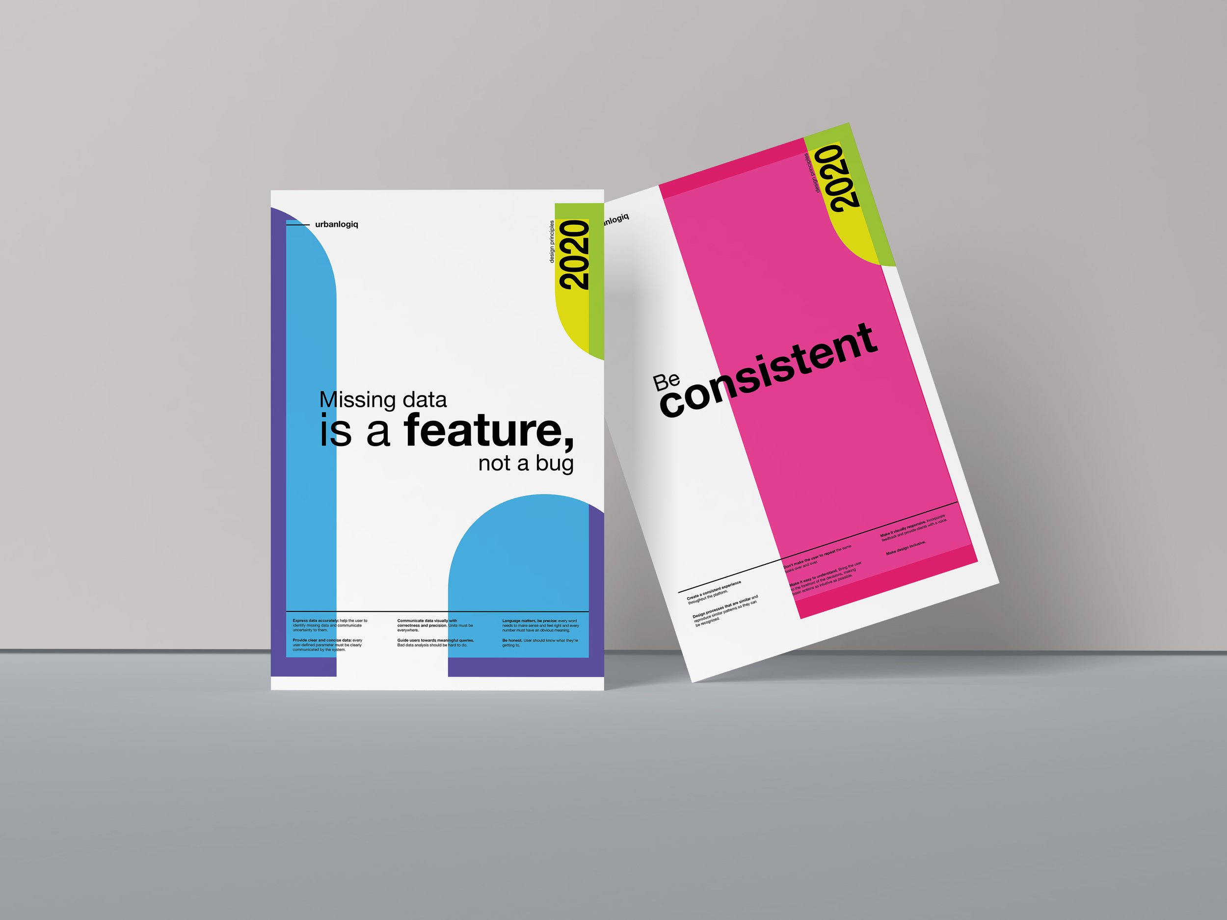
1. Missing Data is a feature, not a bug
Represent data accurately. Help the user to identify missing data and communicate uncertainty to them.
Communicate data visually with accuracy and precision. Units must be everywhere.
Language matters: be precise. Every word needs to make sense and feel right and every number must have an obvious meaning
Provide clear and concise data. Every user-defined parameter must be clearly communicated by the system.
Guide users towards meaningful queries. Bad data analysis should be hard to do.
Be honest. Users should know what they’re getting to.
2. Be consistent
Create a consistent experience throughout the platform.
Design processes that are similar and reproduce similar patterns so they can be recognized.
Don’t make the user repeat the same tasks over and over.
Make flows easy to understand. Bring the user to the forefront of the decisions, making basic actions as intuitive as possible.
Make flows visually responsive. Incorporate feedback and provide clients with a voice.
Make design inclusive.
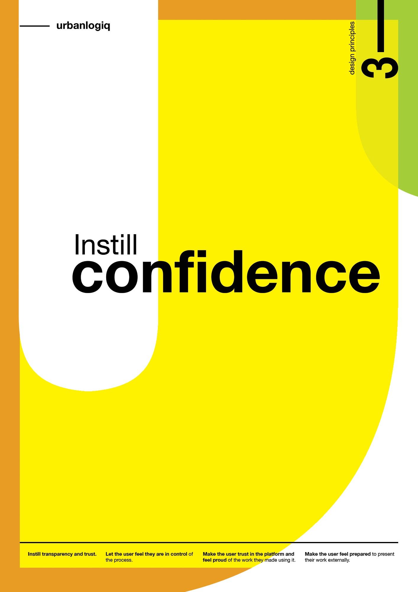
3. Instill confidence
Instill transparency and trust.
Let the user feel they are in control of the process.
Make the user trust the platform and feel proud of the work they made using it.
Make the user feel prepared to present their work externally.
4. Simplicity is king
Good design is as little design as possible. Concentrate on the essentials, be clean and minimalist.
Strive for clarity and friendliness to beat data overload.
Simplified over complicated.
Only provide what is necessary. Do not show things that the user doesn’t need.
Contrast makes things clear.
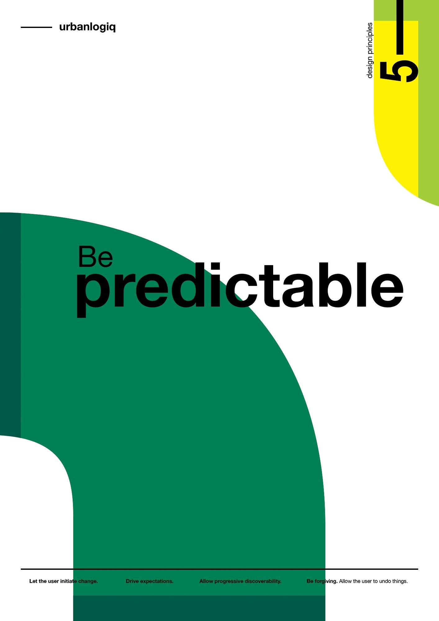
5. Be predictable
Let the user initiate change.
Drive expectations.
Allow progressive discoverability.
Be forgiving. Allow the user to undo things.
Posters time
The final step is to share the result of the workshop. We decided to create posters for each one of the principles and place them on the office wall, so everyone sees and gets back to them whenever a design decision must be made. We also added the principles to our Design System, so they could access them remotely as well. The design is from Giselle Pereira, my team collaborator at UrbanLogiq.